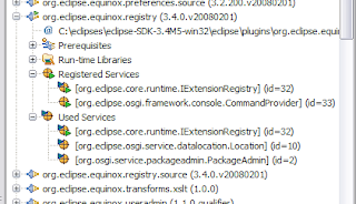
In PDE, we’re working on adding OSGi Services information to the Plug-in Registry view… the question came up on how these things should be visualized. It turns out that creating icons for OSGi services is a painful task. This was our initial stab at it:
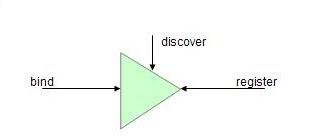
Not so bad eh? Well, when talking to Equinox Framework extradonaire, Tom Watson, he was a bit confused by the icons. He pointed me to a picture that Peter Kriens uses to describe OSGi services apparently:
That’s cute… I can see that Peter was trying to describe that only one bundle can register a specific service (pointy side of triangle) and multiple bundles can bind to it (flat side of the triangle). However, this doesn’t really help me in creating an icon that normal people would understand… also… why a triangle? So I tried to hack something up quickly in a budget paint program:
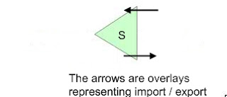
Ok, I kept the triangle… hypothetically put an ‘S’ on it to represent service… than I put arrows on the top and bottom of the triangle to represent “importing” and “exporting” services. Nope, I’m not satisfied with this crap either. Actually, when I think about it… visualizing services is as confusing as driving in Boston:
How does everyone out there picture OSGi services in their heads?


