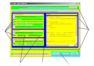
I had a colleague of mine ping me this morning and ask me why I was making the Eclipse workbench look like a pride parade march? Let’s analyze this picture (thanks Simon) for issues:
- labels for padding? Is that really the best solution here
- there’s some pixel waste here
- some extra whitespace lying around
- not sure what that is exactly
- 21 pixels for spacing is excessive, how about 5?
See, colors can help. Also, I didn’t meant to pick on the JDT team here, this is just one example of many you can find in the workbench. Furthermore, each UI can have its own style, so the choices of the developers aren’t necessarily wrong.


