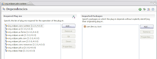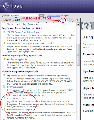
Can you see what’s wrong with this picture? Most people can’t. Only a few people like Kevin McGuire who like to nitpick and subscribe to the religion of color can spot the problem quickly. I call these people pixel pushers. In my opinion, these are the people that make Eclipse look good due to their attention to detail.
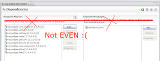
Now getting back to what’s wrong, here’s a hint:

Oh my eyes! When I saw this it hit me like a ton of bricks and I had to fix it immediately.
Why does this happen? Well, there’s the unfortunate situation when Eclipse Forms sections are given text clients with things like toolbar managers to add cool icons. This results in text clients taller than their title text so things grow accordingly causing adjacent sections to possibly not align. If you would like to learn more about this problem, check out this unpublished article on some new things in Eclipse Forms 3.3 by one of my favorite people in Toronto, Adam Archer.
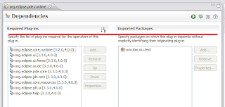
Here’s how it should look like:

Ah, much better!
What’s the fix? Align adjacent sections using the text client height difference:
section2.descriptionVerticalSpacing = section1.getTextClientHeightDifference();
Does this make me a pixel pusher too?


